Closed for business
  • Skip to main content
  • Skip to primary sidebar
  • Skip to footer
  • Start Here
  • What Do You Need?
    • ๐Ÿ’ป Overview
    • ๐Ÿ“ Web Design
    • โš™๏ธ Development
    • ๐Ÿ›’ Ecommerce
    • ๐Ÿ‡ผ WordPress
    • ๐Ÿ”ง Admin & Maintenance
    • ๐ŸŒ Logos
    • โŒจ๏ธ Content Writing
    • ๐ŸŽ“ Consulting
  • Testimonials
  • Examples
  • Tips
    • ๐Ÿ—‚๏ธ All
    • ๐Ÿ“ฐ Articles
    • ๐ŸŽž๏ธ Videos
    • ๐Ÿ”Š Podcasts
  • About Us
  • About Ilkeston
  • New Website Guide

Ilkeston Web Design

Small Business Websites That Help You Sell

How to Avoid Classic Graphic Design Logo Mistakes ๐Ÿ™„

Home ยป Tips ยป Stupid Graphic Logo Mistakes

April 8, 2014 by Ilkeston Web Design

Darren and Lee discuss strong design concepts, the damage done to brands by ill-conceived business logos, and how to avoid classic mistakes real designers will always spot.

Watch video on YouTube

Don’t have time to watch a 40 minute video? You can fly through the embedded slides below.

In the Presentation

  • What is graphic design?
  • Logo ideas that communicate clearly
  • Why so much bad graphic design exists
  • Why businesses produce weak logo concepts
  • How NOT to design a logo
  • Famous logo examples
  • Why you should invest in a strong design idea
  • Sending provisional ideas to a client

Logo Design Gone Wrong…

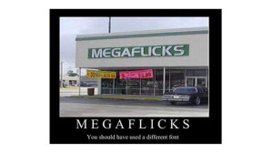
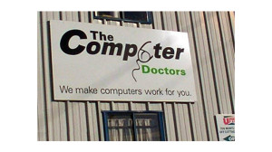
In the video discussion we talk about (and laugh at) Logo Design Gone Wrong: 10 Offbeat Examples

Bad Logo Design

The first example of a confusing logo concept. Logos like this should never be approved.

Bad Logo Design

Shocking example of a logo gone wrong. How do people not notice these things?

Bad Logo Design

All this needs is a couple of spaces so the words do not run into one another.

Bad Logo Design

Another example of how bad typeface can confuse the message the business is sending.

Bad Logo Design

Oh, come on!!

Bad Logo Design

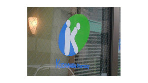
It’s got to the point where you’d wonder if someone did this on purpose! What was this even TRYING to advertise?

Small Businesses Copying Big Brands
Orange Logo Original

This is an example of corporate identity. Small businesses with tiny budgets in a competitive market ought steer clear of logo concepts such as this. It’s too abstract.

Samsung Logo Original

Another example of a meaningless logo concept. Samsung’s huge advertising budget makes all the difference to their sales, whereas a small business without a big ad budget needs to work harder to communicate with what they have.

Please no not settle for a logo like this. It's crap.

Please do not settle for a logo like this. It could be done so much better.

Filed Under: Discussion, Graphic design, Graphic logos, Marketing, Tips, Video Tagged With: communication, derby, design, logo, marketing, nottingham

What Do You Need?

Do you require a new website or modifications to your existing one? Are you considering a redesign?

I'm not currently taking on any clients but you'll find some helpful information below...

Primary Sidebar

Need Help with Something?

Got questions? Want to work with me?

Footer

Navigation

Home
Services
Testimonials
Web Marketing & Sales Tips
New Website Project Guide
Portfolio
About Darren
Contact

Social

YouTube
SoundCloud

Contact

Based in Ilkeston, Derbyshire

Copyright © 2025 Ilkeston Web Design · ICO number: ZA305900


Web Design in Nottingham · Web Design in Derby · Privacy Policy · Terms & Conditions