This case study outlines the building of a new website using WordPress and overhaul to certain marketing operations for a local double glazing company.
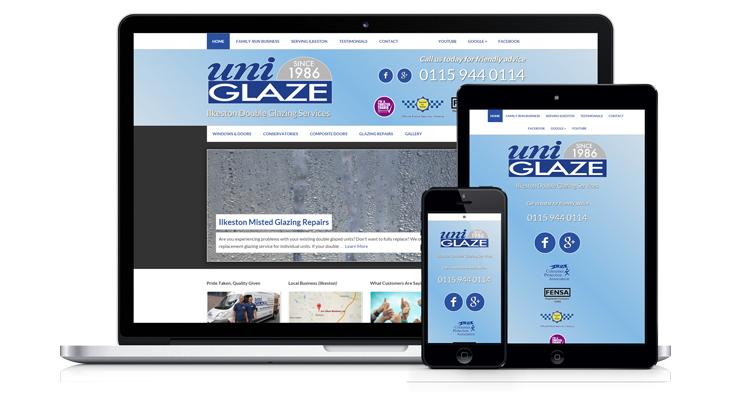
Uniglaze Windows is a local double glazing, doors and conservatories company serving Ilkeston and the surrounding area. The new Uniglaze Windws website is built using WordPress and is mobile responsive.
The site was previously unresponsive (meaning it was a fixed-width design and would not adapt itself on-the-fly for different devices) and quite thin in terms of content. John, the owner of Uniglaze, agreed and wanted to do something about this.
Here’s what the website looked like previously:

The first thing I did was to produce a web design/development questionnaire and solicit is as much information as possible to get an overall idea of the size of the project.
It was decided that we would rewrite all previous content and emphasise the 30 year history and family values of the business.
This is evident with the use of more photos of John, which have appeared on the front page and in the right hand sidebar of the other pages. 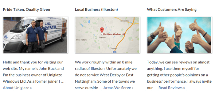
The top header and navigation area was recreated to vaguely resemble UPVC and light blue gradient gave a friendlier look. Uniglaze is a member of trade bodies and associations including Derbyshire Trusted Trader and Fensa, but in the previous website, these logos were not included in the header.

I added these logos in the header and made sure that when clicked, they would go through to a page on the website where John would explain why he was a member of those organisations.
Educating and informing the website visitor to convert them from a casual browser to a much warmer sales lead is done by earning the trust of the reader.
This is why it’s important to spend time writing up content. Documenting the finer points of the business can take time but it was worth putting this effort in to helping John communicate in the best possible way. We stayed away from any hyped up corporate sales copywriting and were sure to point out that no salesmen are employed whatsoever.
The results of the content-rich pages do the business much justice.
Testimonials
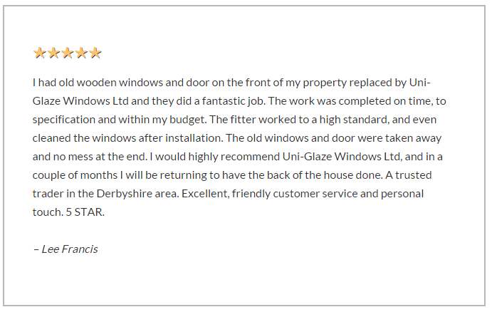
The previous website design did not emphasise testimonials at all. Actually, it had a “guestbook” which looked rather out of date. A better strategy was to introduce a testimonials section with dedicated pages linking to online reviews.
Derbyshire Trusted Trader Reviews
Since Uniglaze is a Derbyshire Trusted trader, a page all about Derbyshire Trusted Trader was created with an attractive graphic. On this page I asked John write his own thoughts about the scheme.
Also on this page we copied all the reviews from the actual Uniglaze Trusted Trader profile so vistors wouldn’t necessarily need to leave the website. However, it’s important to cite your sources and so a link to the external Trusted Trader profile was created to prove none of the testimonials had been made up!
Google Reviews
The same thing was done with a testimonials page for the Uniglaze Google reviews. I was adamant about doing this since Google is known to randomly deleted genuine reviews because their aggressive automatic vetting filters seem to wrongly believe a particular review is false.
I copied each of the reviews to the page but used CSS to style the gold stars.
Logo Redesign
Additionally, the logo was redesigned into a vector logo. The old one was a slightly blurry JPEG and looked extremely poor in the context of the new website. It had to be changed urgently. ![]()
Using Adobe Illustrator, the logo was completely redrawn to sharpen all the edges. It was even embellished with “Since 1986” because the logo was being redesigned after 30 years trading. ![]()
Now that the logo exists as a vector, it can be used for screen or print without resolution or quality issues. In fact, it was used in a set of business cards designed to tie in to the theme of the website.
If Uniglaze wanted to print a set of leaflets or uniforms, they could use the newly created logo to do this. Any commercial print shop will be able to use a vector graphic. Similarly, if Uniglaze wanted to pay for a billboard advert with their logo on it, they would use this logo too since the scale is no issue.
Technical Developments
The website changes aesthetically on the front end and technically on the back end. Using WordPress, dozens more options were available. However, it’s always a case of knowing what to leave out as well as what to put in.
Permalink Structure
Some of the original permalink structure of the previous website was kept intact to hold on to any SEO advantages. Obviously, Google had already indexed the pages and if were to alter the page links, potential visitors coming to the site from the search engine would be met with a 404 not found error.
Redirects were used in some cases to forward visitors to new page URLs if they tried to access an older page link.
![]()
Easy Google Review Experience
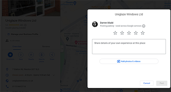
Another technical trick we were pleased to implement is a technique for getting customers over to the Google Business Profile in order to leave a review.
Just to set the scene, imagine you are talking to a customer if on the phone or in person, and you would like to ask them to leave a review.
Assuming they have pen and paper ready (or maybe they’ll try and remember) you want to give them a short, easy-to-remember link for them to visit so they can immediately leave a review.
The problem is, a standard Google review link is far too long and complicated to remember or write down. If something is too difficult for a customer, they will just abandon the process altogether, so, I created an easy redirect link using www.uniglazewindows.co.uk/google
This forwards to the longer, harder to remember Google Review URL.
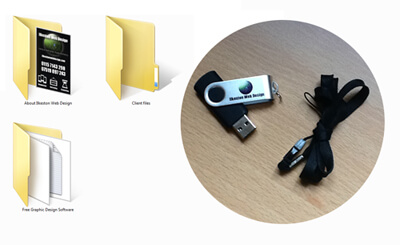
Graphics and Logo Source Files Handed Over
Once the project was complete, all the files were loaded on to an Ilkeston Web Design USB stick and given to the client.
View Website
Visit Uniglaze Windows website