In a world of information overload, minimal visual language online offers a superior user experience, so make your website clean, simple and purposeful. 
Have you seen Gordon Ramsay’s Kitchen Nightmares? Or Alex Polizzi’s The Hotel Inspector? What do those television programmes have in common with a website?
Well, in almost every meeting, the TV consulting expert will ask the business owner or manager to consider subtracting unnecessary, extraneous or poorly performing elements from the business to bring about a renewed purpose and focus. Here’s a few examples:
- An overloaded menu is redesigned and does better with fewer options
- A hotel reception area is decluttered to improve the first impression
- A gaudy dining space is recomposed to create a greater experience
“Killing your darlings” for the greater good is a sentiment shared in many disciplines, from architecture to engineering, from music to photography, from writing to gardening, from hotels and kitchens and of course, in marketing and advertising.
Why Less is More in Website Design
We live in an abundant economy. The internet has given everyone a platform, everyone a voice. Hundreds and thousands of websites are springing up daily and it’s a problem for those sites that do not appeal all that much to the average visitor.
You may be operating in a single industry, but it’s worth keeping in mind that your competition includes the rest of the internet itself. The distractions internet users face are unlimited, whether it be chatting with friends on social sites or laughing at pictures of cats.
Website visitors are fickle because there are so other places to go and other things to do online, with the standards constantly being raised.
- Is your website overloaded?
- Is it busy and frustrating?
- Are you giving visitors a reason to “bounce”?
The Worst Website Ever
The website screenshot below is a caricature on bad design. You can visit this website at http://www.theworldsworstwebsiteever.com. Take a look at the gimmicks and pointless design elements:
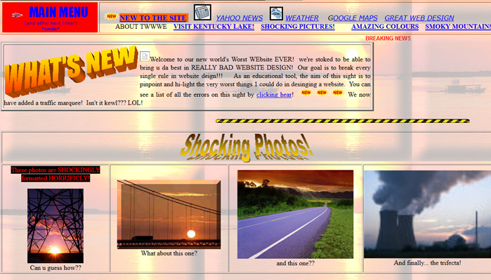
Doesn’t this just make you feel nauseous?
Benefits of Minimal Web Design
A zen approach to design is in vouge, perhaps to try to aesthetically negate the very real problem of information overload. Make no mistake though, a simple approach is no fad.
Think of it this way: if we’re to be bombarded with information and have marketers compete for our attention, the way these propositions are presented should be palatable enough to get past our internal mental defences that tell us “No”.
There is nothing worse than landing on a website that is so laden with information that it will not even load quickly.
“Don’t use a lot where a little will do.” – Some clever proverb
By adding too many design elements they will compete with each other and possibly alienate the website visitor.
Here’s a few key points to remember:
- Simple navigation gives a better user experience
- Faster loading websites are the antidote to a decreasing online attention span
- Responsive mobile design is easier to manage when there’s less HTML containers and fewer iterations of the CSS
Space Has Value
White space is like silence – just because it exists, it doesn’t need to be filled.
White space in web design makes the difference between a layout that’s ordered and easy to comprehend versus fatigue and headaches.
Buttons, links, text, and other media all need room to breath. The spacing between them improves overall composition and forms the overall “picture” and general experience.
- Compositional white space – Space for margins, padding, and general layout
- Visual white space – space for graphics, icons, buttons
- Textual white space – Space between headers/paragraphs and lines of text
Consistent Action Colours
Anything on your site that can be “clicked” should ideally use the SAME colour throughout the whole site. This is to train your website visitors to recognise what is supposed to be clicked and what isn’t.

Summary: Design for Business Outcomes
- Minimal design is not to be confused with laziness or lack of ideas
- Don’t use more than two typefaces on your website – settle for a harmonious mood
- Avoid using multiple colours for links and buttons
- You are creating a business website, not a pub fruit machine(!)