This is the stage where photos and images would have been received, and work can begin on visual/styled/aesthetic aspects of the site such as headings, paragraphs, icons, maps, forms, bullets, numbering, testimonials and contact info.
Based in Ilkeston, Derbyshire, and serving the Nottingham and Derby area, I provide website services, including development, for small to medium businesses.
1. Artworks Reception/Update/Creation (Photos, Illustrations, etc)
Photos and illustrations from the client should have been received at this stage.
These can be cropped and sized as required, using variations for thumbnails or full width for sliders.
2. Logo Creation
If a new logo is required, the client would be asked to view the following video as an introduction to how to come up with a logo.
By this time, most of the website written content would be complete or nearly complete, meaning there would be plenty of information to use as a logo design brief.
The video may be 40 minutes but it’s not boring and actually humorous in places.
There are certain mistakes you don’t want to make and these are mentioned in the video discussion between me (Darren) and Lee, a local graphic designer.

3. Design Header
The logo and website description normally go in the top left.
What is especially important is that you provide a simple, clear description of what the site is about or who it is for.
It’s fine to use a mission statement or statement of intent, but don’t use jokes, puns or clever wordplay.
A few words about your primary services or operating area will do…
4. Add Phone Number to Header
Ideally, your primary phone number wants to be in a visible location at the top of every page, with a call to action if possible.
5. Design Clear Navigation
The best navigation consists of two rows of links or buttons running horizontally across the top of the site.
A rollover/colour change effect is desirable and images/icons can be placed next to each link/button. This could tie in with the logo.
In some cases, a drop-down menu can be added.
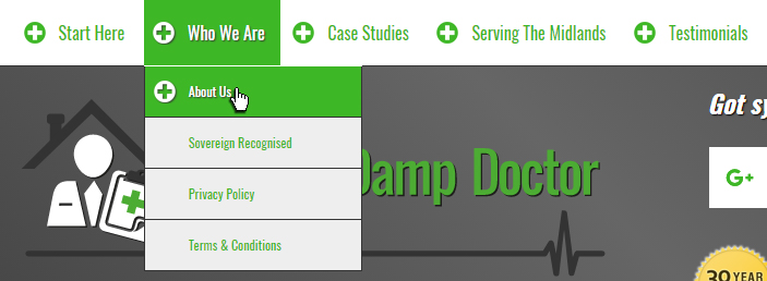
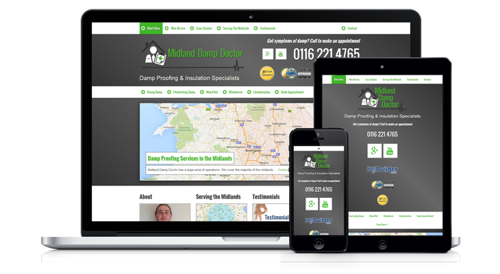
Of course, any type of website navigation needs to translate well to mobile, which means users will be tapping links/buttons with their index finger instead of operating a mouse.
Adequate spacing around each link/button should be included to prevent a user tapping the wrong thing.
6. Design Main Content Areas
The content areas, sidebars and footers must be consistent. Any borders, drop shadows, spacing or other design embellishments can be added to tie in with the logo.
7. Position Important Content Above the Fold
Are you familiar with the phrase “above the fold?” It actually comes from the print publishing world and refers to the way newspapers are folded horizontally.
As you can imagine, that top 50% of the front page of the newspaper is the part that gets seen most.
Similarly, websites load at the top, and show – figuratively speaking – the tip of the iceberg.
That is where the most important words, image, video etc belong.
8. Balance Illustrations/Photo with Text
There’s nothing worse than a wall of text. Images help break up the monotony of text and help communicate the message.
Beware though: Too many images slow down the loading speed of a site, which is not good for mobile users with a low battery and bad wi-fi.
9. Design Testimonials, Reviews and Awards
If you’ve received some especially good reviews, or if you’ve won some meaningful awards, these could be displayed prominently on the website.
Google reviews, for example, can be redesigned for your site and can be displayed on sidebars, on a dedicated page or within the content.
10. Embed Google Map
Ideally, we want to get your business listed on Google maps, and then embed a map with the red marker identifying your business into the website.
Clicking the red marker highlights any Google reviews you may have.
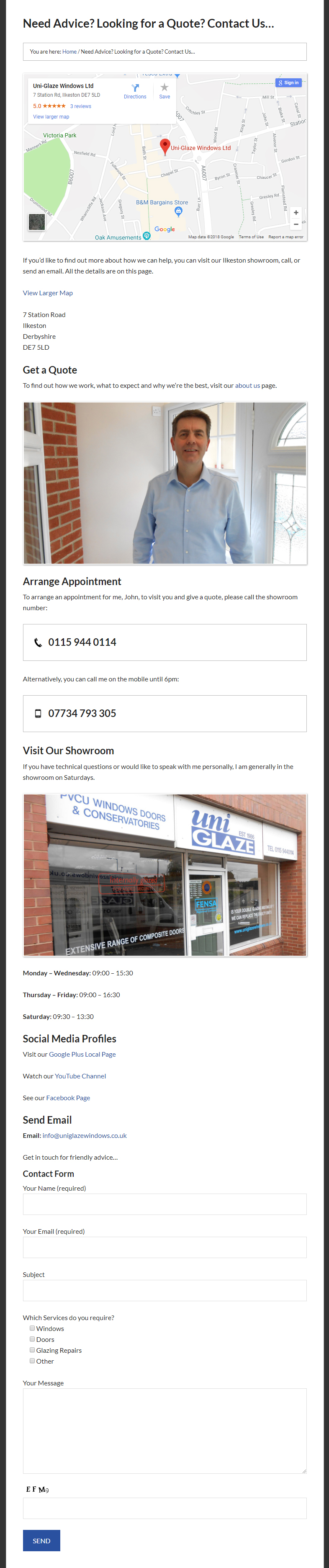
11. Make Sure Company Information and Contact Methods are Easily Accessible
It’s a good idea to have the address details on every page of the site, usually somewhere in the footer.
Obviously, your site should have a dedicated contact page where everything a potential customer needs to get in touch is available.
Click the image below for a larger view of an example contact page (opens in new tab)
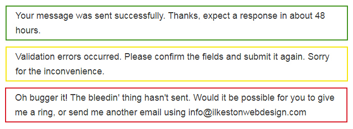
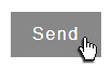
12. Style Contact Form Reporting (Error, Validation, etc)
Another thing to mention is the email contact form. When someone submits a message they need to be told if the message was sent or not.
Red, yellow and green can be used to emphasise what has happened.
13. Style Lists
It’s possible to use bulleted or numbered lists, like these:
- Bullet
- Bullet
It’s also possible to change those bullets from circles to squares…
- Bullet
- Bullet
…or use images instead…
- Bullet
- Bullet
14. Style Search Forms
And another thing: Search forms on your site can be customised with whatever text you want. The colours and style could be altered as well. The ones shown below are pretty basic.
15. Style Newsletter (Site Functionality and Email Format)
You may or not want to do a newsletter. If you do (and if you want people to subscribe via your website), the email optin form can be styled at this point. It will match the colours, layout and design of the rest of the site.
Also important is the configuration of the newsletter emails themselves.
16. Design Buttons, Sprites, etc.
It’s helpful if links and buttons change their colour when a user hovers the mouse cursor over them.
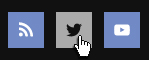
It’s also helpful if links that have already been visited display a different colour to those that have yet to be clicked.
17. Design Favicon
The favicon is a tiny image that can be made to display on a browser tab. The favicon will be created once the rest of the site has been designed.
In the example below, the favicon is a miniature version of the website logo.
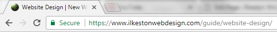
This will look slightly different depending on what browser and device you’re using.
New Website Guide
Menu
- ⚖️ Quote Submission
- 🗃️ Preparation
- ♟️ Planning
- 📰 Layout
- 🖇️ Content Preparation
- 🧩 Content Integration
- 📐 Design
- 🪛 Technical and Usability
- ⚙️ Putting It Online