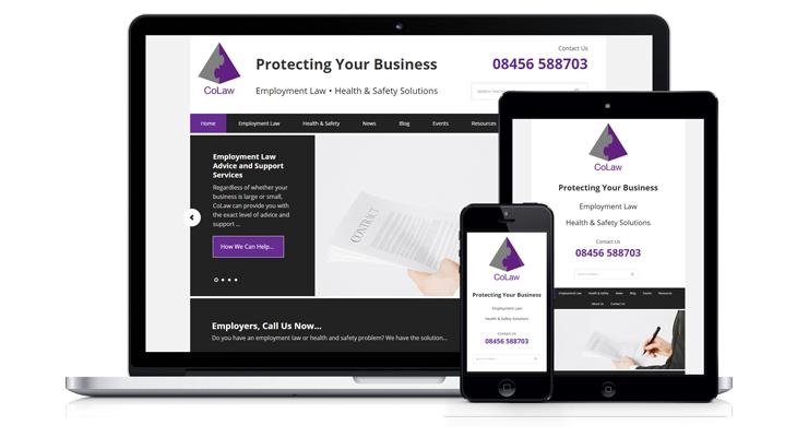
The web design brief for this project was to convert the existing fixed width setup (on an unidentified content management system) to a mobile responsive WordPress setup with additional improvements.
An audit of the website prior to redeveloping it showed multiple issues and opportunities for improvements.
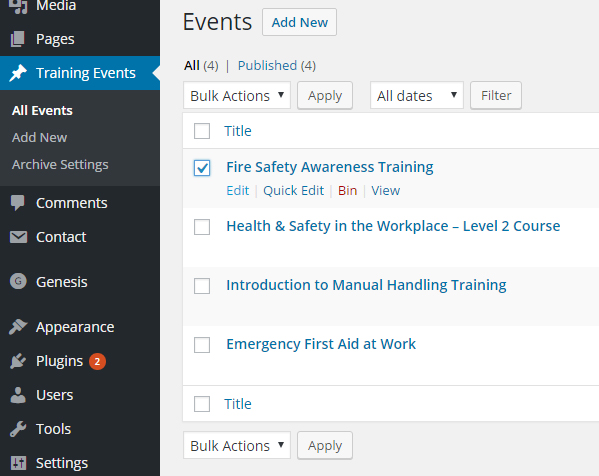
Among the complaints of the person tasked with managing CoLaw was that the website management dashboard was confusing and hindered productivity.
It was messy on the back end and messy on the front end.
Planning the Redevelopment
Here’s a video demoing how the site looked before it was reconstructed:
If you watched the video, many problems were identified, not least the lack of it being mobile.
A 30 minute video overview of the new site is at the bottom of this webpage.
While many aspects were earmarked for improvement, the website page hierarchy remained as it was, with most of the permalinks staying intact.
The colour scheme and brand identity was basically to remain as is.
That is to say the use of the colour purple would be used throughout the site for clickable links and buttons, as part of the call to action psychology.
Mostly this was already in place, but on some of the pages there would be passages of plain text (not clickable links) that had been rendered in purple.
Watch the short video about website action colours for clarification.
Redeveloping the Site for Mobile Device Screen Widths
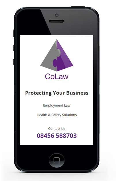
As with any mobile site development, part of the criteria is to design in such a way that the site automatically adjusts its layout to fit smaller devices.
How many “smaller devices” are we talking about?
Well, there’s desktop, laptop, tablet and phone. But we have tablet in portrait as well as horizontal, and we have phones in portrait besides horizontal too… so it’s not really a question of how many devices, but how many screen widths.
What type of internet access will a user on mobile or tablet have access to, and how fast or slow is their device?
These are some of the pressing concerns taken into account before such a site is built. Images are one of the culprits in prolonged load time but thankfully, the original version of CoLaw had very little imagery at all, which is a good thing.
Header Area Changes
The header was designed to loosely mimic the layout of the previous site header, with the addition of actual web text for the strapline, instead of an image with the strapline.
This means you can highlight/select the wording with your mouse cursor. This is significant because it now means search engines can understand those words.
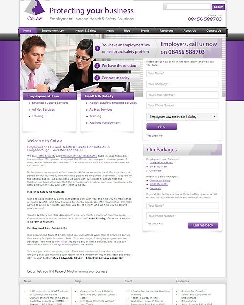
You’ll also notice the old layout seems to have the logo cropped out at the top! The apex of the pyramid design is missing, so that was remedied.
Better, Higher Quality Image Logo Format (and Lower File Size)
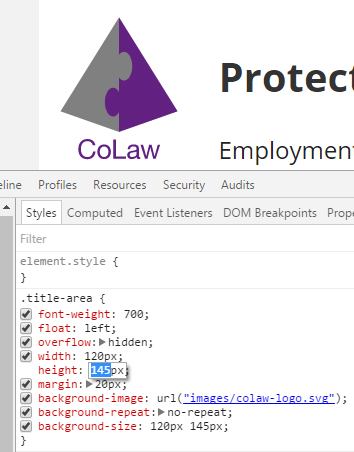
The opportunity to use an SVG (scalable vector graphics) logo was seized upon, since the old site used GIF, and I knew for the purposes of mobile design, the logo could be resized for different devices using CSS.
SVG is a W3C approved graphics format, smaller in file size yet superior in quality. The logo can be scaled infinitely without loss of quality, unlike GIF
In a mobile responsive stylesheet, you can “call” a single SVG instead of multiple .GIFs at varied sizes, and the SVG can be resized for the different mobile screen widths.
The goal is to shave off some of the load time associated with calling too many images when the site can only display one at a time.
By default, WordPress doesn’t allow the addition of SVG but some tweaking makes it possible and very worthwhile.
Homepage Changes: More Impact with Less to Look At
Being a text-heavy site, it became necessary to reformat the text drastically in order to have it look good and be readable. Every page of the site used a tiny font with poor use of paragraphs.
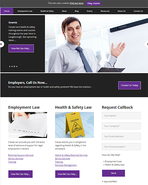
The general formatting and layout was immediately changed, most notably on the front page, which, with a new slider design, better placement of objects and obvious call to action buttons.
These improvements transformed the website experience into something coherent.
The design is “flat”, meaning all the drop shadows and embellishments on the former site had been removed, mainly for aesthetic reasons.
Dispensing with clutter is discussed more in The Zen of Web Design.
Improving General Page Layout with WordPress
The front page of the new site is actually a full width layout, with inset columns at various parts of the page. The old site also used a full width front page.
The new front page is also a full width layout.
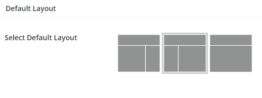
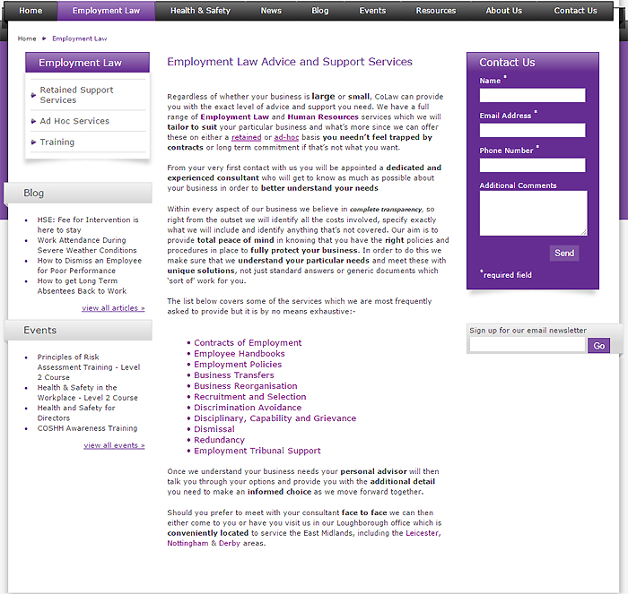
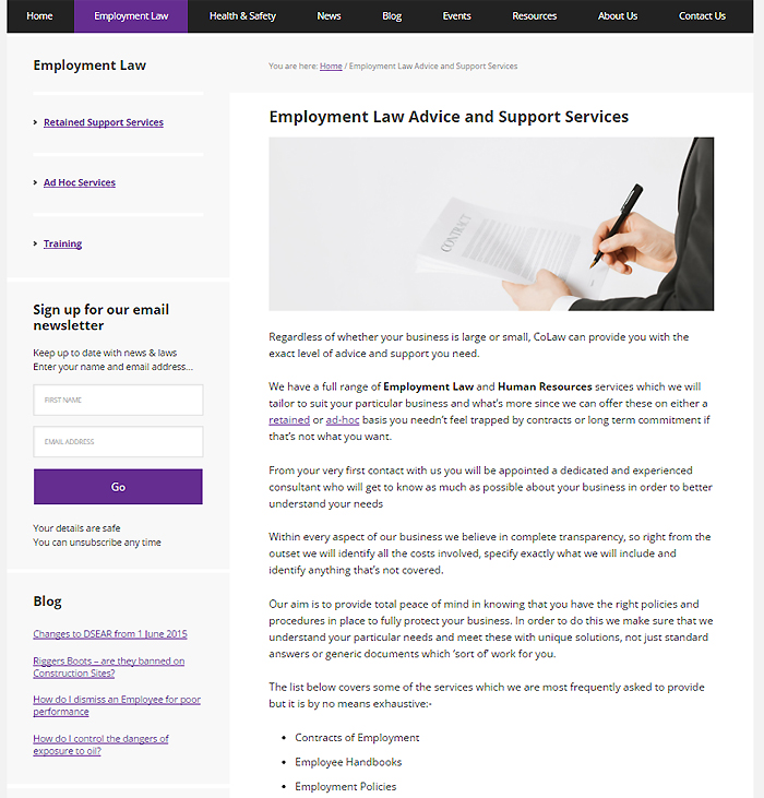
The old site used a 3 column page layout, whereas the improved version is using a 2 column layout, with the sidebar on the left.
Old site page layout:
New site page layout:
The sidebar also incorporates a new email opt-in form, linked to the InfusionSoft email management system.
Blog Improvements
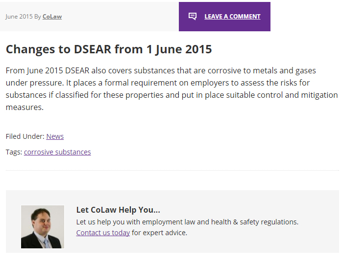
The blog system was overhauled to work better on the front as well as back end, since no tags or categories were used for the old system of managing/displaying blogs.
Crucially, a call to action section was added to the bottom of all posts:
Improvements to Events Pages
Among the best of the new features is the much needed addition of WordPress custom post types. These are designed outside the scope of the typical Post/Page editor found in your bog standard WordPress dashboard.
There’s nothing wrong with the default way of doing things, except that custom post types output a very particular type of post, with required fields asking the user to input certain criteria for the sake of consistency.
You could use custom post types to advertise jobs, sell products or… publicise events, as CoLaw is now doing with greater success than the previous site did.
Let’s take a peak at one of the pages from the Events section under the old system:
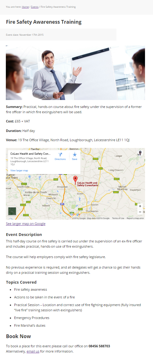
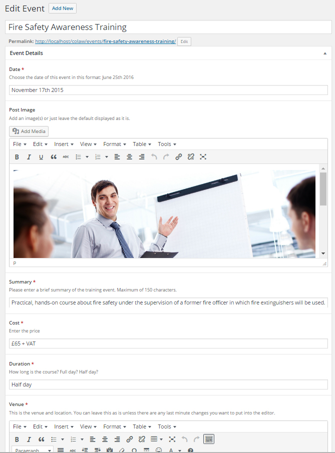
And now compare that to the WordPress custom post type system for the Events pages:
Much of the information you see in the screenshot above is automatically added.
The featured image, map and the headings are already populated when the user creates a new event, which is what a custom post type is.
All the user needs to do is enter the information about their event.
It’s almost like providing answers to questions, with constraints already in place to keep everything organised.
For example, there are character limits on certain fields to force the user to condense descriptions.
Completed Website Video Overview
The video below demonstrates how the site works and the benefits of the added functionality.
It delves into more detail than anything you may have read on this webpage, so do watch the video for more nuanced examples of the design, development and functionality.
